
News
Previews 01

All enquiries, please contact the Support Desk

2026
Collaborations
Invitations
Situations
VOID™
Electronic Edition
Public Art
Websites

Selected case studies in architecture, ecology, publishing, public art, and music
01: Selected case studies in architecture, ecology, publishing, public art, and music
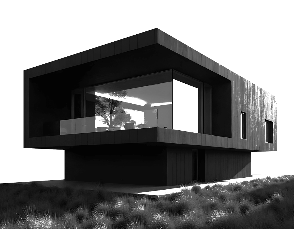
Architecture
Inspired by British sculptor Henry Moore—climate-adaptable architecture
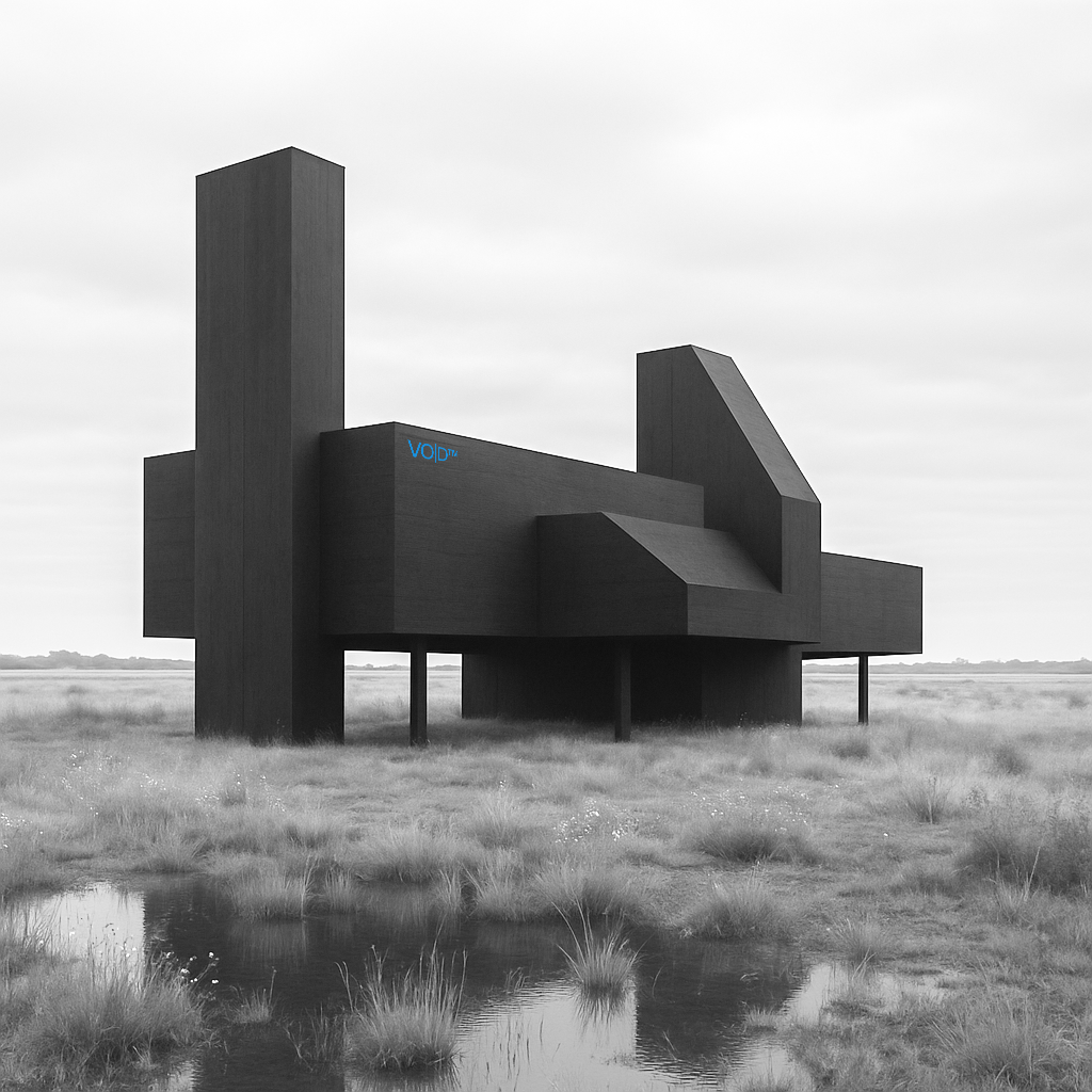
What if Henry Moore designed climate-adaptable architecture? Introducing VO|D™ — ecological architecture and land installations conceived for the overlooked hinterlands of Britain.
VO|D™ offers an alternative pathway to owning contemporary architecture: one that adapts to climate, supports ongoing research, and invites a deeper, more personal escape into landscape. Inspired by the regenerative cultural value of the Turner Contemporary and the sculptural integrity of Henry Moore, this is more than a home — it is a place of withdrawal, reflection, and restorative terrain.
Advised by MADOR environmental architects, VO|D™ also rethinks how marginal or damaged land can be repurposed — offering something rare: brutal beauty, delivered with long-term care for ecology, design, and human wellbeing.
In response to widespread district council concerns around Britain’s abandoned fringe sites, VO|D™ proposes a model of active regeneration — where overlooked land becomes valuable again through conceptual architecture that is both inhabitable and regenerative. It is a solution shaped by sculptural thinking, ecological intelligence, and emotional return.
Contribution
Creative Direction / Brand Designer / Architectural Concept / Author - EfW Research Paper ‘VO|D’—UK Trademark No. 00003525876
VO|D™

Websites
Websites designed for guidance, featuring an Energy for Waste (EfW) and a Zero-waste Media Facility.

Street Studios and Monksleigh present two parallel exercises in website architecture — built with the similar UX strategies and wireframe systems, yet responding to entirely different audiences. One serves advertising, film & the wider creative industries, the other, energy from waste expertise. What unites them is an intentional quietness: interfaces that do not get drawn in to what the clients knows, but what they must make others see, a system familiar with art galleries.
A—HUMAN digitally framed Street Studios through a monochromatic lens — a direct nod to black-and-white photography, but also to the clarity that this large studio space provides. The use of Suisse font and bold spatial breaks give it an editorial edge, allowing content to breathe without competing for attention. Monksleigh, meanwhile, applies the same structural logic to a technical resource platform. The tone is minimal, but not sterile — functional design with room for curiosity. Both sites were mapped in Figma, with additional spatial logic for Street Studios modelled in SketchUp — so clients can project map within a space in advance. The same movement, across downloadable specifications and reports, was translated into flows and layout systems to prioritise ease of use without impacting other resources. In both cases, the outcome isn’t just minimalist design. It’s a study in how restraint, hierarchy, and patience can make digital environments feel trustworthy — even generous—only designed to assist.
Contribution:
Creative Direction / Site Designer / UI/UX / Wireframe / Brand Assets
Street Studio Hire / Monksleigh ‘Energy from Waste’ Consultancy

All Rights Reserved | A—HUMAN 2025
Publishing
Experimental artists and creatives reveal new projects, and the MACHINE they most want to become.

Electronic Edition is a specialist art magazine that merges electronic culture with sustainable print — featuring exclusive work by Mercury Prize nominee Hannah Peel, actor, artist and poet Scroobius Pip, and electronica DJ and artist Michailo, who — while imprisoned for possession during Georgia’s mass-sentencing era — distributed his music using USB sticks.
This unique collection of artworks from A—HUMAN also features collaborations with visionary musicians and artists including Portishead, Scanner, Test Dept, Graffiti Pig, Northern Kind, gaming institution EA DICE, and the concept electronic project Eccentronic Research Council, led by BAFTA-nominated actor Maxine Peake. The best way to explain EE is to reimagine electronic technology as a kind of optical 3D sequence — something closer to abstract futurism. Each of the 86 staple-free pages has been pre-perforated, allowing readers to remove and frame the work — as if walking through a temporary gallery and curating a personal collection. This playful interaction sustains both the lifespan of the artwork and reduces the environmental impact of print. Printed on large-format, FSC-approved A3 paper, Electronic Edition invites you to tear it out, stare at it, and pretend to understand it — just like in a real gallery.
Contribution
Creative Direction / Brand Designer / Guest Artist Commissions
Electronic Edition Vol.001
Public Art
The art of instructional graffiti, social anthropology, free pamphleteering and sustainable commerce

Including, the new ‘Social Anthropology’, ‘The Escape Plan’ and fanzine ‘Instructional Graffiti’ gallery pamphlets and merchandise — SUBS was conceived to reframe what it means to create and consume public art.
In a world where digital platforms dominate discourse, an unsanctioned scribble remains defiantly analogue — proving that sometimes, the most authentic statements are the ones written in permanent marker on a short or at a bus stop. Unauthorised guidance — whether crude, poetic, or absurd — exists to label, inform, or declare, often without artistic ambition. A toilet wall scrawl of a phallus captioned simply “penis” is both redundant and profoundly human. A discarded mattress tagged with ‘VACANCIES’ is practical, yet quietly poetic. Marketing isn’t always big > Instructional Graffiti’ captures the raw, unfiltered voices that exist outside traditional commercial spaces — unbranded, unfiltered, and with absolutely nothing to hide.
Responsibility:
Creative Direction / Brand Designer / Product Design
SUBS
All Rights Reserved | A—HUMAN 2025


• Two-way stretch 100% recycled polyester
• Made in a new super lightweight sports fabric: 4.7 oz./yd.² (160 g/m²)
• Long-sleeve
• UPF50+ protection
• Rounded shoulder yoke
• OEKO-TEX 100 standard and Global Recycled Standard (GRS) certified
Sizing (oversized for a relaxed fit)
XS 92cm (36 ¼) / S 96cm (37 ¾”) / M 100cm (39 ⅜”) / L 108cm (42 ½”) / XL 116cm (45 ⅝”) / 2XL 124cm (48 ⅞”) / 3XL 132cm (52”) / 4XL 140cm (55 ⅛”) / 5XL 148cm (58 ¼”) / 6XL / 156cm (61 ⅜”)
Delivery
This product is created as soon as you place an order, which is why it takes slightly longer to deliver it to you (approx. 7 days / shipped in small jiffy-style bag that takes up less space in transit to help reduce carbon omissions). Creating products on demand instead of in bulk helps reduce overproduction, so thank you.