DESIGN
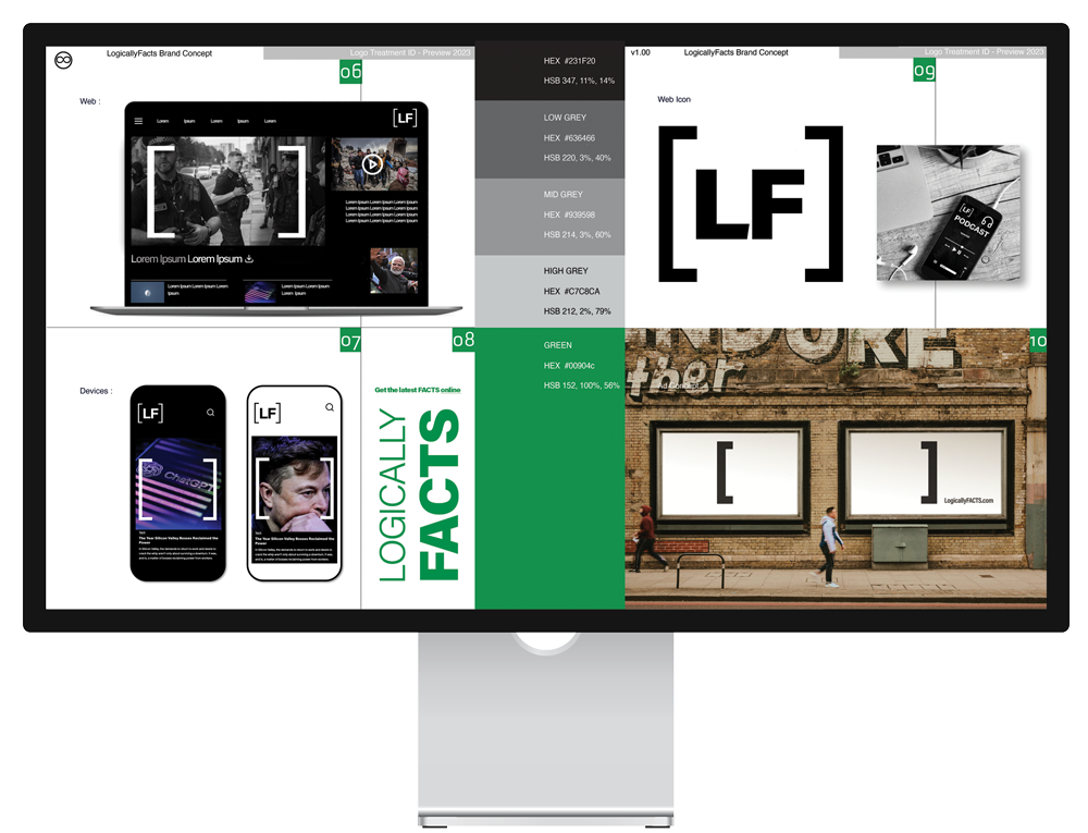
The mark came out of the newsroom rather than the studio. In journalism, square brackets mark the point where an editor has intervened in a quoted source. They are the visible seam between what was said and what was added. That convention became the identity. The brackets frame photography, iconography and headline furniture across every Factcheck article, and they do the same job on the page that they do in a sentence — they tell the reader where the source ends and the publisher begins. For an organisation whose product is the distinction between original content and editorial addition, no other device was required. Black, white, and one green.
INSTALLATION
The system was built to be handed over. Site UI, infographic language, editorial illustration, social templates, business cards, garments — the frame scales from a favicon to a billboard without redrawing. That mattered more than elegance. Assets were distributed to teams working in different markets, on different platforms, under deadline, and the identity had to stay intact in hands that had never spoken to the studio.